If you read Step One for Color Confidence I hope that you’ve been thinking about a room that you want to re-color and restyle.
The first step is to examine the function of that room and the mood or feeling tone that you want to create.
Color can greatly influence how anyone feels in a room. Use this color meaning chart to help you with your decision. Also take your personal color choices into this equation.
-
Red: energy, strength, success, stimulation
-
Yellow: health, happiness, warmth
-
Orange: vibrancy, dramatic
-
Pink: romance, femininity
-
Blue: intuition, emotions, tranquility, soothing
-
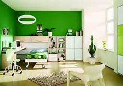
Green: prosperity, growth, friendliness, health
-
Purple: wealth, success, royalty, drama
-
Brown: stability, contemplation, calm, comfort
-
Gray: coolness, formality
-
White: purity, cleanliness
-
Black: wisdom, mystery, grounding
Sometimes the easiest way to select a color palette is to first rule out all of the color that you do not like.
Next, select colors that you LOVE and that make you happy, not colors that are trendy at this moment in time. Decorators and designers that are color consultants select three colors for any one room. To pull a house together, for more of a designer look, it is recommended that those same three colors be used throughout the house (this will be covered in Step Three).
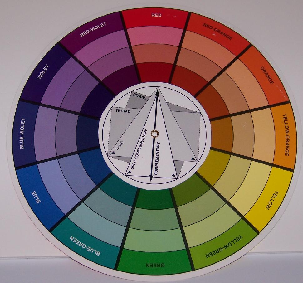
Refer back to the color wheel for the next step. Besides selecting colors to create a feeling tone in a room, how you use those colors also affects how a room functions. Look for your first color choice on the color wheel. To create a pulled together and classy look the easiest choice is a:
- MONOCHROMATIC color palette- For this palette the colors (not just paint) for the room are of the same hue (color). So if blue was your first color choice then a monochromatic palette would be:
Foundation Blue Darker Lighter


If you want to create a more “colorful” space then try an:
- ANALOGOUS color palette- This palette uses the foundation color (blue) and the two colors on both sides of that color on the color wheel.
Foundation Blue-Purple Blue-Green


If this is TOO much color, any one of them could be changed by changing the TINT of that color (adding white)


If you wish to create a room with more vibrancy and drama then select a:
- COMPLIMENTARY or SPLIT COMPLIMENTARY color palette-
A complimentary palette is the foundation color and the color opposite on the color wheel.
Foundation Blue Compliment-Orange


A split complimentary palette is the foundation color with the two colors next to the compliment:
Foundation Blue Split Compliment-Red Orange Split Compliment-Yellow Orange


Add even more drama with a:
TRIAD color palette-
This palette has 3 colors between each.
Purple Green Orange


Here are some rooms to help you with your decision:
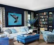
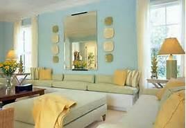
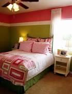
Monochromatic color schemes
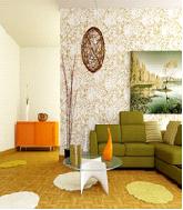
Analogous color schemes
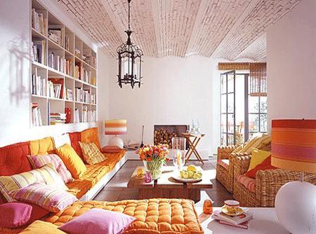
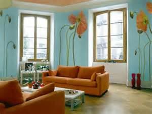
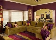
Complimentary & Split complimentary color schemes
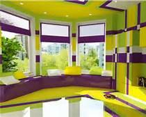
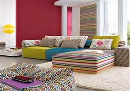
Triad color schemes
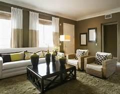
Note that in almost all of these photo examples, neutrals play an important part in the feeling of each room. Step three will include more information about the use of neutrals.
It is also important to understand that the colors used to create these palettes are not just in paint but in the furnishings, flooring, accessories and all other elements of the design. There are designer formulas for using these items and for the impact that they will create. Look for Step Three for Color Confidence in the next month here on Sierra News Online.
www.dreamredesigns.com or ginger@dreamredesigns.com
![]()